
What Determines a Players Rank?
Looking into what determines the rank of a volleyball player in the Big 10 Conference using data from the 2023 colleigate season and creating a streamlit app.
Introduction
Volleyball has always been a love of mine. It is one of the reasons I decided to persue a degree in statistics. I wanted to be able to analyze and make predictions based of off the data that is kept during volleyball games. One thing I have always found interesting is player rankings. Why do certain players get ranked higher? What skill is the most valued when looking at rankings?
These are a few questions and more that can be answered by looking at the Big 10 Conference volleyball player rankings from 2023. You can view these rankings online here. We will be exploring the answers to these questions and how to use it to make an interactive streamlit app to explore the data even further.
Exploring the Data
The first thing I did to explore this data is look into the correlation between all of the numeric variables in the data set. These variables include kills, assists, aces, blocks and digs. The correlation can tell us which variables are related to another.
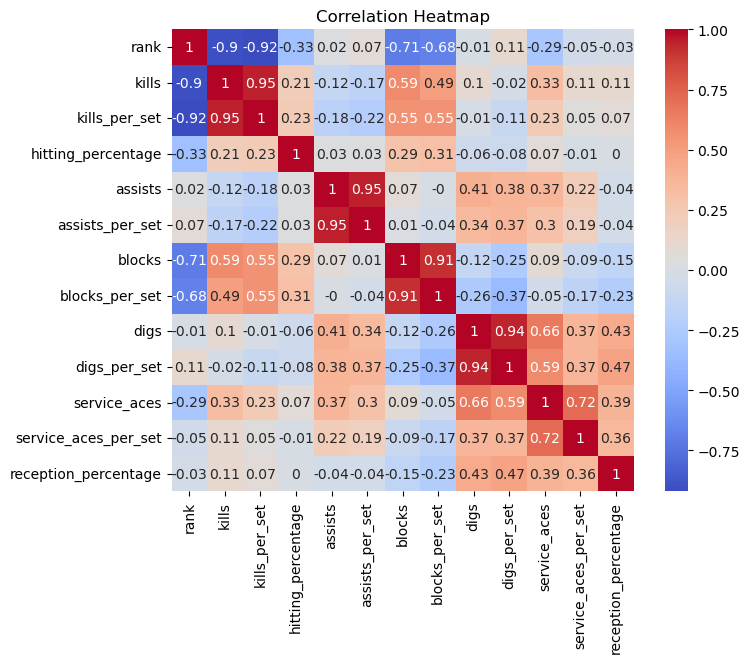
As shown above in the correlation matrix the skill most correlated with rank is total number of kills and kills per set. This indicates to us that compared to any other skill the one that has the highest affect on ranking is the offensive attack. A kill is when you get a point off of hitting the ball. This shows that ranks are affected by points scored. The other skills do not generally result in a point, besides aces
Another interesting trend we can see in the data is between aces and digs. We can see the relationship of these two skills by look at the correlation coefficient, which is 0.7, and by looking at the scatterplot between the two points.
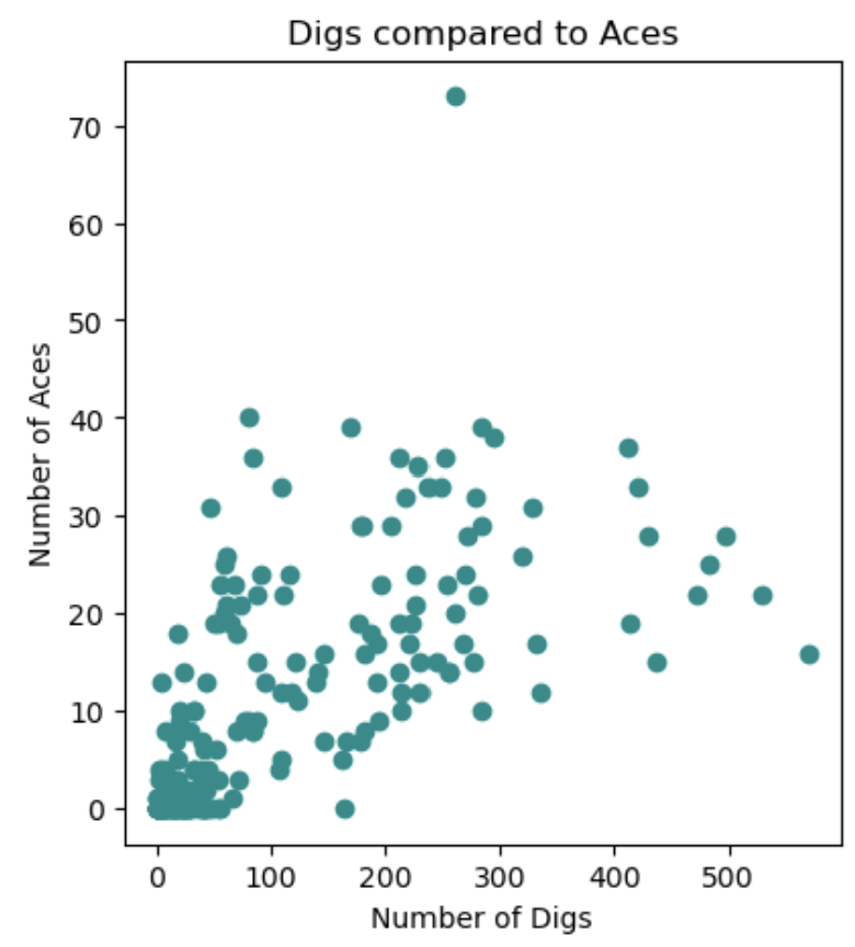
There is a clear upward trend. This is interesting because every player on the court takes a turn serving the ball. However, the best servers also seem to be those who do well in the back row.
The Streamlit App
To be able to explore the data even more we can use a streamlit app. To see the data and the code to make this app you can go to this github repository
To create this app I wanted to be able to use many different graphs so the first thing I did was create a plots.py file so that I could use the graphs multiple times without having to retype them out. The two main types of graphics I used were a scatterplot and a barplot. The code of the scatter plot looks like this.
def rank_comparison(data, x = "Rank", y = "Kills"):
    z = get_right_name(y)
    d = get_right_name(x)

    fig = px.scatter(data, d, z, title=f"{x} Compared to {y}")
    return fig
This function can take in any two numerical variables, but I set the default to be rank and kills. The function titled get_right_name() is defined above this one. Its function is to take the name that the user inputs and switch it to be the same as the name in the data set.
The next thing I did was add several different elements to my app. To do this I used the streamlit features of st.radio(), st.tabs(), st.expander(), st.selectbox(), st.textinput(), and many more. You can find documentation on how to find each of these here.
Another important element of the app is being able to put in text to do this you can use these commands:
- st.header(): Which creates a page headers
- st.subheader(): Which creates a subheader slightly smaller than the header
- st.markdown(): Which allows you to put text into the blog post There are other ways to add text these are just three that I used
Exploring The Streamlit App
The streamlit app can be accessed by clicking here.
When you first open they app you will be on an introduction page. This page will explain a little bit more about the purpose of the app and the data that is used to create the graphs. It also gives an overview of all the skills in the data.
The next page is called “Graphics and Exploration”. On this page you will find two different tabs. The first tab gives you the chance to compare different skills to each other. The first scatterplot on the page shows a comparison between the skill and the rank. It will display the correlation between the two variables along with several other statistics about that variable. The next graph has a simular function, but it allows you to compare any two numeric variables found in the data set. Finally, you can see the correlation matrix between all the numeric variables at the bottom of the tab.
The next tab labeled “Individual Players” allows the user to input the number of players they would like to see, if they want to see the highest, lowest, or randomly ranked individuals, and what skill they would like to look at. These factors will be shown in a barplot to the left and a table directly below.
Conclusion
Sports data can be fascinating, especially when it’s from a sport that you love! Now that you’ve seen behind the scenes into the creation of a streamlit app, try it out for yourself! Use this app to come up with your own insights, or apply it to data of your own! As always, leave me a comment letting me know what you thought of it and what exciting information you were able to uncover!